TMX Logo Concepts
It's been a challenge coming up with something typographic for an acronym like TMX. Here are some ideas.
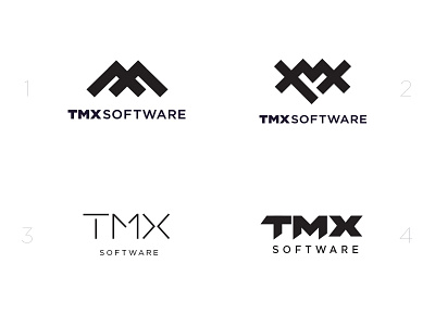
1- A play on coding brackets turned 90 degrees. The company also has a location in near a mountain range so the brackets become hilltops. Also, the owners last name begins with M. :)
2- Using similar shapes as the first concept, this one uses the three letters overlaid on each other. "T" is turned at an angle, the "M" spans across, and the "X" closes the shape. The center is an abstract heart, because the owner believes that his team is like family.
3- A simple modern sample with thin architectural lines, in contrast to the thickness of the other concepts.
4- These letters were created using the same size chevron shape
Do you have a favorite?


