Avatar

Top or Bottom

Shot_1271534475

8 Responses

  1. Avatar Doug Neiner

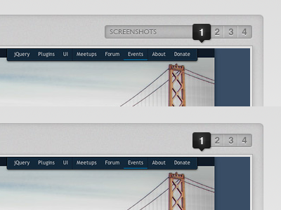
    Ok, so should I go with the larger slightly more obvious label (on top) or will just numbers with a clear "You are here" indicator (bottom) be enough. Note: these images will not auto move from 1 to 2 to 3, etc. A user will have to click to see 2, 3, etc

    about 2 years ago

  2. Dan-social-avatar Dan Denney

    Lose the label, the target users of this site "get it" IMHO

    about 2 years ago

  3. Avatar_tw Ethan Turkeltaub

    What Dan said. If your audience knows what exactly it is, then there's no need for the label.

    about 2 years ago

  4. N519616647_9548 Dave Bedingfield

    Kill the label, especially as it looks too much like an actionable item, IMO.

    I'd consider adding prev/next arrow controls, either on opposite sides of the numbers or tied in with the content that is actually changing. And since there is no autoplay (bravo!), it's double-important, IMO.

    about 2 years ago

  5. Nathan_tcdisrupt_large_square Nathan Fitzsimmons

    ^^ Ditto.

    about 2 years ago

  6. Avatar

    Thanks for the awesome feedback guys! I dropped the label, added left/right nav to the number part, and also put labels at the bottom of the image to navigate to the next item. It allows the labels themselves to help drive clicks. (Inside page, Logo Closeup, etc);

    The inset background fades off by the bottom of the screenshot which is why it is no longer there at the bottom!

    about 2 years ago

  7. Pro Gravatar2 Chris Coyier

    Or if it did have a label, it might not need to be within "the pit"

    about 2 years ago

  8. Avatar Doug Neiner

    @Chris I might try that as a way of showing the label for the currently showing page.

    about 2 years ago

keyboard shortcuts: previous shot next shot L or F like