Levers Historical Data Explorer tool

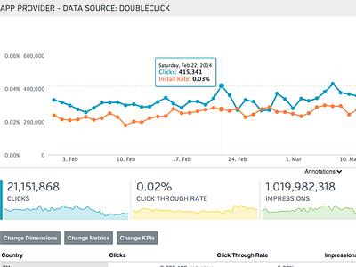
A clip from inside the historical data viewer with the first three KPI's showing. Blue line is indicated by left bar on the KPI below (orange one is off to the right). Table of chart data follows below. Blue three buttons open a dropdown menu allowing all the KPI's from the historical data import to be graphed.
Learn more at: http://leve.rs/analysis/


