2013 - Saddened Brick on an error page

Hi,
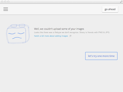
I was thinking, error screens are something you'd like to be seen by as few people as possible. So today I'm sharing our app error screen to talk about its design goals.
The error screen design, broadly, is responsible to express empathy and guide further on. This is the moment you need to be clear and supportive as ever.
- express that we are sorry, too
(I DO get frustrated when a customer hits an error page, if only she didn't come from Dribbble https://dribbble.com/shots/1614815-404-Disaster :D)
- define clearly and precisely what has gone wrong, if technically possible
- give an explanation
- provide a more detailed info and a guide for successfully completing the task
- overall, motivate enough to return back and try the same thing again
- don't cut off other options - that is to quit the flow and abandon this bloody task
The idea here is pretty unsophisticated – a component fell out of place.
The empathic guy here is Smarty, though definitely saddened in this awkward situation. Actually, the sad brick was the first drawing ever in the series to appear. He was sketched multiple times and for some time resembled toaster a bit, had been a cat, a goat, a wolf, a bear, an owl, a bat, a tv and some random guy in a winter knit cap.
here's glassy Smarty:
https://dribbble.com/shots/1602998-Smarty
;-)
Alice


