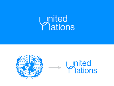
UN logo rebrand - proposal
A rebrand I did for the UN logo. I noticed that their current logo isn't unique (too cliche) & has too much detail.
In my design approach, I wanted to make the logo simple and at the same time add meaning to it. Hence the overlapping of letters U & N which denotes unity, togetherness, or oneness.
brand identity
branding
logo design
logo designer
logo icon
logo identity
logo rebrand
logo redesign
logo remake
logos
united nations logo
View all tags
Posted on
Aug 7, 2021
More by Dickens View profile
Like


