Find designers
Designer search
Quickly find your next designer
Post a job
The #1 job board for design talent
Inspiration
Courses
UX Diploma
Learn UX design from scratch in 6 months
UI Certificate
12-week UI skill building for designers
Live interactive workshops
with design professionals
Jobs
Go Pro
Log in
Dribbble: the community for graphic design
Log in
Sign up
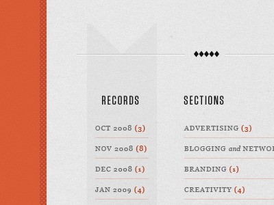
Records
Brian Hoff
Follow
Following
Like
#E5E5E5
#D95B35
#A3A3A3
#555555
#B84733
#DDBDB2
#BA593E
#C88774
Download color palette
arrow
cross hatching
dividers
lists
orange
texture
vintage
View all tags
Posted on Apr 16, 2010
7,149
5
99
13
View feedback
Brian Hoff
More by Brian Hoff
View profile
Previous
Next
Loading…