Find designers
Designer search
Quickly find your next designer
Post a job
The #1 job board for design talent
Inspiration
Courses
UX Diploma
Learn UX design from scratch in 6 months
UI Certificate
12-week UI skill building for designers
Live interactive workshops
with design professionals
Jobs
Go Pro
Log in
Dribbble: the community for graphic design
Log in
Sign up
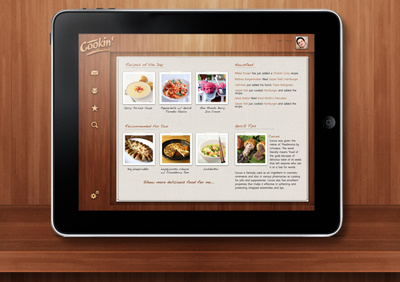
Cookin' Social
Sarp
Follow
Following
Like
#140F0D
#DAD5CE
#905133
#65311D
#A76B4B
#C0926A
#917E79
Download color palette
An overal look at Cookin' Social.
+ Happy to be here.
book
cook
cookbook
hyperisland
hyper island
interface
ipad
paper
texture
ui
wood
wooden
View all tags
Posted on May 3, 2011
5,196
5
82
9
View feedback
Sarp
More by Sarp
View profile
Previous
Next
Loading…