Crooked Letter Creamery

Hey there friends! It's been a while. Haven't had many projects going on in the background as it's been busy at the agency these past few months.
I've been excited to share some recent work though for a budding new venture called Crooked Letter Creamery. My awesome client Salem is turning her ice cream-making hobby into the real deal and she needed some branding to go along with this exciting, new project.
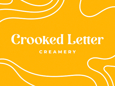
The name is a play on the beloved Mississippi spelling and, of course, an "S" for Salem. Clever, charming and cheerful were some adjectives she wanted the brand to exude and she didn't want anything too obvious or cliche.
This is the final wordmark for the brand along with the primary brand color, a rich and vibrant marigold. It's a customized version of the amazing Lovechild by Beasts of England. I made some adjustments in hopes to match the brand personality a bit more closely without jeopardizing the integrity of the typeface since it's just too good.
I whipped up some fun sub-marks as well as some packaging ideas so I'll share those soon. Let me know what you guys think!


