Find designers
Designer search
Quickly find your next designer
Post a job
The #1 job board for design talent
Inspiration
Courses
UX Diploma
Learn UX design from scratch in 6 months
UI Certificate
12-week UI skill building for designers
Live interactive workshops
with design professionals
Jobs
Go Pro
Log in
Dribbble: the community for graphic design
Log in
Sign up
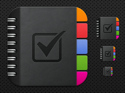
Actionnotes Icon Re-hash (sizes)
Aidan Hornsby
Follow
Following
Like
#252525
#3F4041
#E03541
#6B8CDD
#9A907F
#F48A0C
Download color palette
Just about finished re-drawing this at various sizes, any tips for final improvement would be great!
Rebound of
ActionNotes Icon Re-hash (Detail)
By
Aidan Hornsby
actionnotes
black
book cover
chrome
grey
icon
ios
ipad
ring bind
silver
View all tags
Posted on May 3, 2011
2,477
4
49
8
View feedback
Aidan Hornsby
More by Aidan Hornsby
View profile
Previous
Next
Loading…