Header Bar

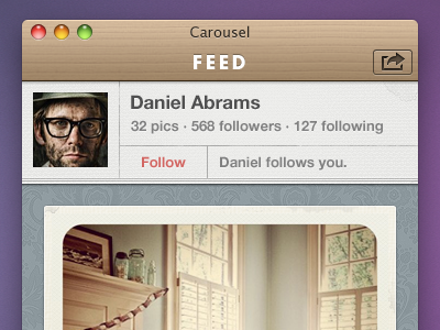
Extending the nav bar style into the title bar. Also showing the user bar here, which is displayed when you drill down into a profile. Getting closer...
Extending the nav bar style into the title bar. Also showing the user bar here, which is displayed when you drill down into a profile. Getting closer...


