Clarity Squared

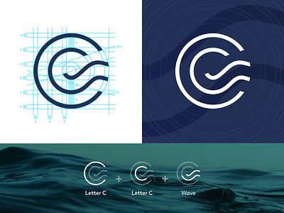

Absolutely loved partnering up with the client to design this gem of a logo! The two letters C reflect the duality of the brand’s name, while a square root also plays in on the brand’s name.
Full case study on my website
👀 more projects at www.zeropoint7.studio
📩 hello@zeropoint7.studio to discuss your logo design or branding project
🤳🏽 Follow for more at: Behance | Instagram | LogoLounge | Pinterest | RedBubble


