Boston Celtics Minimal NBA Logo Rebrand

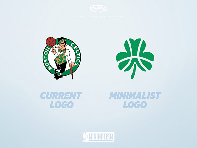

The 1st team in my minimalist NBA rebrand project is the Boston Celtics.
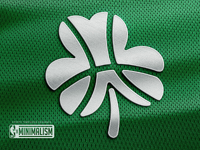
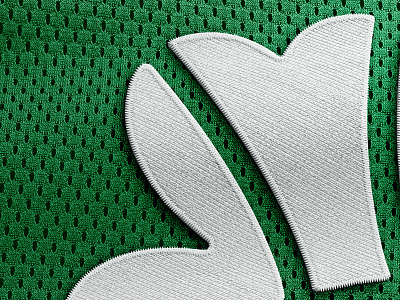
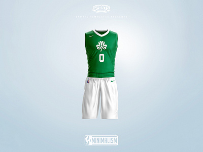
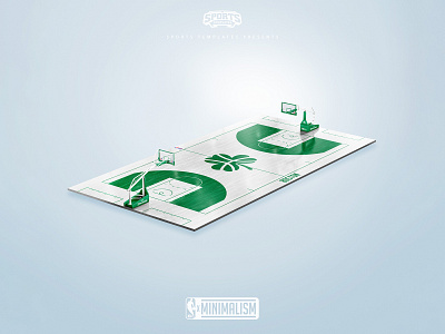
Despite the celtics having such an iconic logo with the leprechaun, it is still too detailed/busy to be properly used on a small scale or in monochrome form, so I decided to minimalize it and use a redesigned version of their original shamrock logo from 1946 but I added basketball ribs to make the mark more interesting and relevant to the game.
What do you think of this minimal rebrand? What team should I do next?
All mockups used in this presentation are from SportsTemplates.net


