Typo-Dashboard

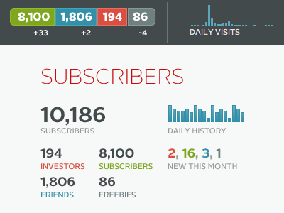
My friend, who runs http://ramenmusic.com/, asked me to prettify his backend dasboard—the numbers are sadly fake, for now. But you should go have a look, the Ramen Music idea is definitely worth spreading.
My friend, who runs http://ramenmusic.com/, asked me to prettify his backend dasboard—the numbers are sadly fake, for now. But you should go have a look, the Ramen Music idea is definitely worth spreading.


