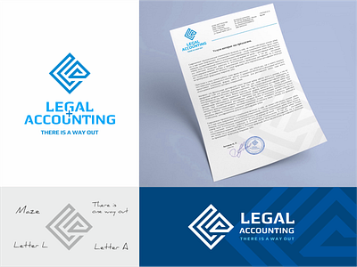
Legal and accounting services logo.
From the brief: "Simplicity. Without pretentiousness and excesses ... formality. Seriousness. Rigor. We are magic that can work wonders with business, help solve problems and find a way out of a difficult situation in the work of enterprises."
Description for the logo: Since the company positions itself as being able to find a way out of a difficult situation in terms of the services offered, the logo contains the idea of a labyrinth, where there are dead ends and a way out. The labyrinth is made in the form of the first letters of the words of the name L and A. By capturing the original idea of the sign, a person remembers it well.
accounting
brand
brandbook
branding
business
company
corporate
design
designer
identity
labirinth
legal
logo
logotype
mark
minimalism
monogram
servises
vector
View all tags
Posted on
Jun 16, 2021
More by Vladimir Pechonkin View profile
Like


