Biltsteyn Post
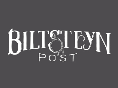
This is the logo I designed for a local magazine for a group of local seniors. The horn, symbol for the postal service of old, placed in the "S" gives a bit more space, while adding a playful detail. I would welcome any criticism. Should I abandon the horn in the "S" and streamline it more? Two smaller postal horns on the sides of "POST" maybe? Or is it good as is? Thank you for your time and have a great day!
View all tags
Posted on
Jun 12, 2021
More by Yannick Kalaydjian View profile
Like


