Fit4Life — Grids & More


Hit "L" if you like it!
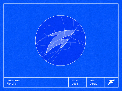
The symbol came out to be pretty abstract — and the wordmark complex. We run them through grids systems to reduce details and make it more pregnable and cohesive.
The stationary design balances the black and white while using the blue as the anchor color. This can also be seen in the social media templates.
Let me know what you think on this case study! If you want to find more rationales behind it, I recommend you visit my Behance:


