


Album Artwork (needing feedback)

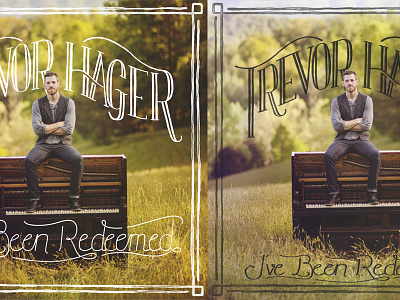


Hey! I'm looking for some feedback on this piece; I'm leaning more towards one version, and my client likes the other. We keep going back and forth between light or dark text, and the transparency of the text, and sizing and such. We're really wanting the background picture to have room to be 'highlighted', but it's getting a bit lost behind the lettering. Any suggestions would be greatly appreciated. Larger version of each cover design are attached.


