Syri TV


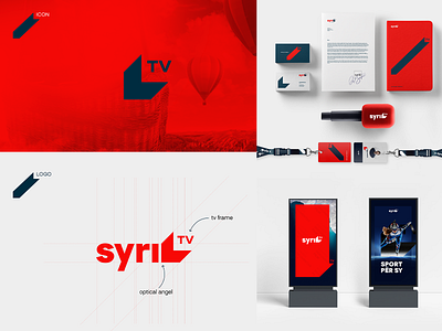


The branding of SyriTV would put the television in a new light. A brand that doesn’t need to shout and is easily recognizable amongst other TV stations.
Syri which is the name of the television in English means the eye and the inspiration partially came from the focal process on how the cornea bends or refracts the light onto the lens and then bends a second time while passing through the lens of the eye finally focusing on the retina. The other part of the inspiration came from the TV itself. So the Icon of the brand is created on the idea of visual perception of the TV and focal process of light passing through the eye. A unique logo that is created to feel premium.


