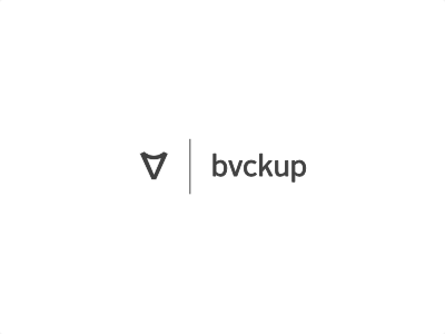
bvckup, version 2
Shaking the project identity up a bit for the upcoming version.
Keeping the "inverted A / delta / shield" symbol from the existing logo, and switching from uppercase Gotham to lowercase Alright Sans. Existing logo is a bit too grand and pompous for what the software is. Needs to be simpler and subtler.
Alternative two-liner version is here. Do you guys think either of these says "simple, yet polished?"
View all tags
Posted on
Apr 28, 2011
More by Alexander Pankratov View profile
Like


