Adapt.js Micro Site

I'm working on a lot of fun things right now. None of which I can really post on Dribbble, because it's all for HP Cloud, and we're not ready to show it off just yet.
But, since I just signed up for Dribbble Pro, I figured I *ought* to post *something* - So here's what I've been working on lately...
——
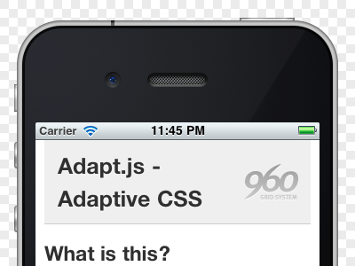
Adapt.js - http://adapt.960.gs
——
It's a snippet of JavaScript that acts like a traffic-cop, sending down only the CSS that's relevant to the particular browser width. It came about due to my disappointment with @media queries not being able to conditionally stop the download of CSS files irrelevant to a particular width. Failed experiment here...
http://host.sonspring.com/media_queries
Anyway, the micro-site isn't all that much to look at. But hopefully as fellow designer/front-end types, you'll come up with some cool uses for it. One such site is...
Note: Adapt.js isn't intended to *replace* @media queries. Rather, to determine which CSS file to send to the browser. Therein could be @media queries to further refine and handle things JS cannot. Screen pixel density, etc.


