Accessible Colour Palette | Digital App Color Scheme

Colour Palette : WCAG Colour Contrast AAA Pass
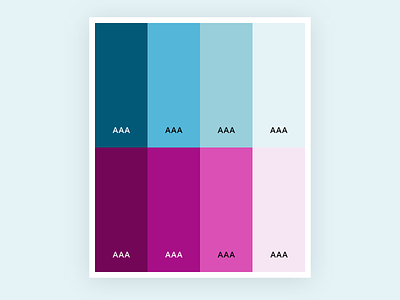
Image alt text: The image shows a palette of 8 colours. The top row is the primary colour set that uses blue tones. The bottom row uses pink tones.
Useage Guidelines:
Use white text on #025977 (dark blue), #730657 (dark pink), #A60F85 (vivid pink).
Use black text on #54B6D8 (vivid blue), #99CEDB (soft blue), #E5F3F6 (blue hint), #DB50B5 (bright pink), #F5E5F2 (pink hint).
Be mindful to use the hint colours carefully and not to define important content areas against a white background as the contrast between those colours and white is not high enough.
This was designed for a client app interface.
If you want any help with designing accessible solutions you can drop me a message on Twitter anytime @Claudia_Sarah_


