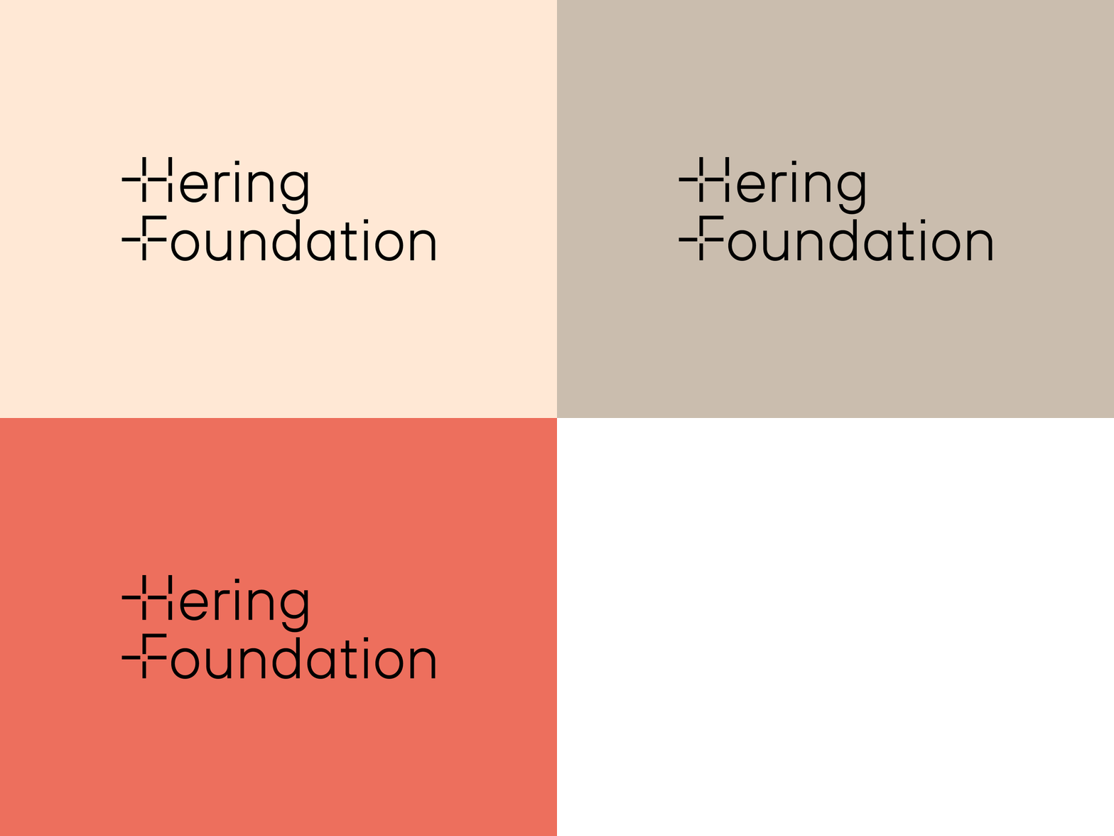
Hering Foundation Identity Design / Logotype Wordmark WIP
Our favorite concept for The Hering Foundation.
The Hering Foundation strives to accelerate human progress and enable equality of opportunity through targeted grants and deployment of specialised technology.
Logotype / Identity concept was inspired by + PLUS as always adding to our society.
Letter marks H & F is made out of lines that resembles into a PLUS symbol.
More by Matis Branding View profile
Like


