Tres Agaves - Packaging

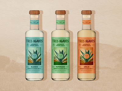
For the packaging, the central illustration is intended to be a window into the bottle, through tequila an illustration can be seen that would be printed on the backside of the bottle to bring to life a tranquil calming moment of surprise and delight. The organic circle badge would sit on the front side of the bottle to create depth and dimension.
The earthy tones keep a natural essence and the typography and other elements on the die cut label would have a slight metallic finish to bring forth a luminance.
The overall concept is Inspired by the notion of finding tranquility, a calm repose from life. Reminding us to slow down, and take it all in. This notion of tranquility was then infused with with the rich history and heritage of the brand.
Completed at Hatch SF


