UNI Rebrand Concept

UNI is a startup out of Austin Texas. I connected with the founders and have been following their journey for a little bit and wanted to do a refresh on their branding because I believe in their message. Having spent the last 10 years in the tech industry designing product/brand concepts, I wanted to lend my skills as to where I thought the design could go.
Uni is a music streaming platform focused on connecting musicians directly with their fans and ensuring artists are accurately compensated for their art. I took their original colors and logo and weaved them into the new design plus added hints of other Copts they had mentioned over the last several interactions as I have gotten to know them.
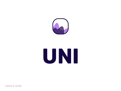
The icon is a rift on your original with a mix of music wave forms. I also thought the overlay was symbolic of UNI the platform and the individual artist. Kinda like the wave form is a duet. That is the concept.
The font is a google font that as a has kind of a Futura feel with less edges. It is ver strong but also has modern feel and tech vibe which I think is very important because the technology is what is allowing these connections to happen. It also has a range of wights to choose from for flexibility but I would start with semi bold and regular as the base.
I tried to stick closely to the main colors you had chosen but I dropped the dingy yellow. I chose white as a base and used a light gray for separating elements in a layout and for illustrations. Too many colors can get overwhelming really quick.


