


Notefile Teaser

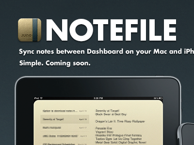
Working on a teaser page for my new app. With all the straight lines, the "Notefile" text looked really blurry no matter what I did with it. I ended up manually tweaking it in the end. I think I'm happy enough with it, but I'm worried it's actually too sharp now. Opinions? Did I ruin Futura?
Next step: create some screenshots I don't mind sharing with the world.


