Nurlabs Branding Slide Deck Share-out

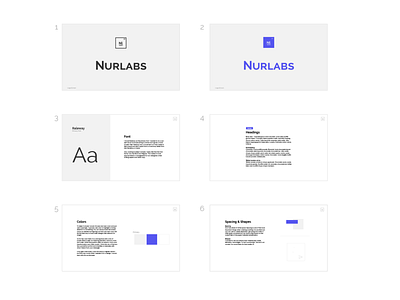
This is the slide deck I sent over to Nurlabs that presented my idea for their logo design. Along with the logo I added explanations for why I chose the fonts/colors as well as examples of it in action. I also added my viewpoints on how to best use it as a foundation that will grow.
I did this because the team is comprised almost completely non-designer so I was trying to help make it simple for them to make choices and have it fit and feel on brand. I wanted to make sure it was not overwhelming for them because from their perspective, they want to focus on the science and technology. That is why I gave them one font that just has a regular and a bold. Less stuff means less decisions which helps them feel confident they can create things without pinging a designer to "make it look pretty".
Same thing with the color choice. I picked one color and advised them to use it sparingly so it can be a common thread as they inevitably build on to it as they continue to grow and change and discover who/what the company really is solving and who they are serving.


