New times, new logo


TL:DR - wow much logo, very new
In 2010, we changed name from Hoist to Podio, which called for a new logo. I'd like to pretend it was designed with great consideration, many revisions, circle grids of ambiguous value and intense optimisations The real story; it was designed in 48 hours, 10 days after I joined the company.
That was almost 4 years ago, arguably way too long for such a lacklustre logo to hang around for.
Which is why I'm happy to announce something that has been in the works for a very long time. A new logo for Podio.
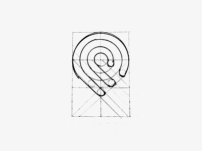
To many it's just a logo, but to us it's proper inclusion to the Citrix family, with the new logo following conventions and standards that were designed in unison alongside 9+ other products, such as ShareFile and GoToMeeting. Things could have turned out very differently if we designed in isolation. But based on an early system defined by other designers at Citrix - The use of thick, solid lines that flow in curves, we're now one brand alongside all other Citrix products. Something that wasn't easy to achieve, which is why it's taken almost 16 months since this new Podio icon was conceived to it's imminent arrival.
The new logo doesn't only signify being a more grown up family member, but also of a product and a team that has taken a big leap forward. Our product design team has doubled over the last 6 months, and we're about to launch some of our biggest changes ever. These are exciting times my friends.
Join me in celebration by hitting the L key on your keyboard.
L