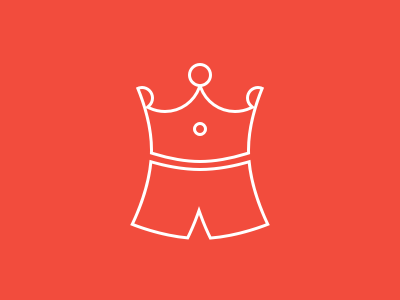
Undercrowned (rejected)

This mark was intended for a project I'm setting up together with a friend, and this is a mark we rejected as the final logo. It's rejected because we're probably going with a different name :-)
The undercrowned mark illustrates a number of concepts:
- undies
- a crown
- the top kind of looks like a stomach with a shirt being pulled up (belly button in the middle)
This would not have been the very final concept (is it ever haha). I think I would change the weight of the line a bit until I'm satisfied. Any other feedback is more than welcome :-)


