


Cluster Health


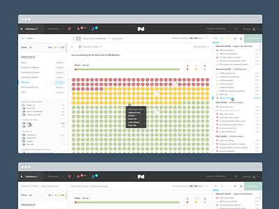


Last October I was given the task to start up figuring out an interface for our users to manage the overall health of their cluster. It has been, by far, the most challenging design task I had to manage in my career. Not just design wise, but also into my involvement in every step in the process of this unique page. There is no other tool, app, ui that makes what we were trying to build, making the task harder. You can’t go and see how xxx is solving this or that solution.
This whole design started by an email full of code lines arriving in my inbox sent by the lead engineer. That was the only starting material. After a two tough months of meetings, emails, debates and talks, wireframings and long hours of photoshop experiments and design the first cut of the design was finished.
We then started the process of integration. This took a pretty long time and my involvement was at first to have a very quick view on the overall progress in the integration. The closest we got to a complete point the more I started to get involved in the final integration touches. Pixel perfect css, transitions and animations and making sure that the UX was right. This required a numerous of small tweaks live in the App that I tried to reflect in the photoshop file in order to keep everything at synch.
Around january we got to a point the app was good enough to start user testings. We conduced a series of user tests. This brought to light many problems into the ui. Not only visual problems, but also navigation and user experience ones.
Learning from that user session I tried to take every user feedback and make a full round of iterations to the pages. This solved some issues but not everything. The app being so complex, a full on boarding starting to be an evident solution. We started with the css team to explore an in house solution for a smart on-boarding composed of information bubbles and live mouse interaction. Making the whole experience way more understandable (teach by the example, there is numerous examples out there doing so, like project management apps that create a fake project for you on on-boarding in order to guide you through the app…). Once we were able to technically go for something nice, I came up with an explanatory design for the final integration. Once this coded we refined the copy with PMs.
This is of course an ongoing journey. Being a unique tool, there will be lots of user feedback and iterations. Maybe we will realize that we failed and we will have to re think everything. So far the user feedback seems very positive.


