Type sketch

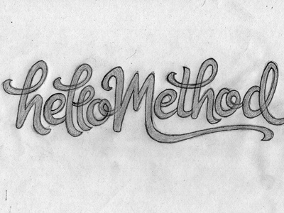
Scan of a sketch I'm about to vector for something I'm working on. Not sure how the two L's will work together, but I'll probably loosen up that part a little bit anyway as it seems a little cramped.
Scan of a sketch I'm about to vector for something I'm working on. Not sure how the two L's will work together, but I'll probably loosen up that part a little bit anyway as it seems a little cramped.


