Madison Carter Property Auctions Logo

Quite a change from the initial concept as the client felt it was a little too minimal for their needs.
I would say this is the safe option that they went for but it was down to a board of directors in the end so it can be all out of your hands at this point.
But I am pleased with the result regardless as it's still a nice, clean, and bold logo. Looks nice and presentable on the business cards and letterheads etc.
The one thing that bothers me is the tagline; I would ideally have liked it to fit the width of Madison rather than creeping out under the 2nd word. Although it looks more balanced with is neatly stowed away under one word it becomes hard to read at smaller sizes.
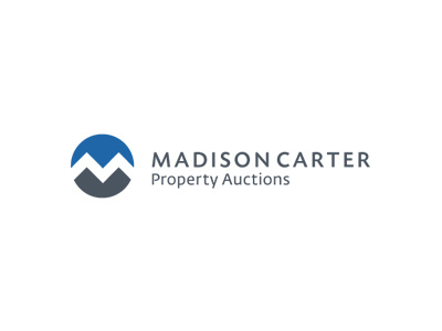
We retain the subtle visual of roof houses formed from the M as we had in initial concept. This is a given really when you use a M just fortunate with the ame. By 2 toning the logo and creating a white space in inbetween we can create something a little more representative of houses in the foreground/shadow and sky in the background.
It is a 2 colour logo using Pantone 432 and Pantone 2945. The stationery will also stick to the 2 colours as the text will print in the grey.
Type used: Today Sans Serif Caps Medium for Madison Carter and Fedra Sans Regular for the tag line. For the cards and letterheads I have used a combination of Fedra Regular and Medium for all copy.