GNC Logo Exploration
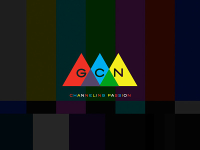
First stab at a logo for GCN Grind Certified Network. A network for passionate people who are always making themselves better. "Getting Right Is Never Done" = GRIND
Arrows are point to the sky to represent upward movement and metaphorically representing climbing peaks to make improvements. Colors are based on SMPTE color bars.
More by Smashing Boxes View profile
Like


