MyLift symbol usage

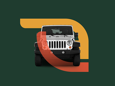
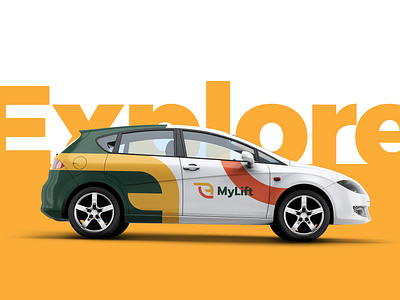
Example of brand components usage for a visual identity project.
The intersection of the symbol with the vehicle aims to enforce the adventurous character of the company.
I love playing around with shapes like that, it always brings interesting results to the table.
Do you also enjoy using similar techniques? Leave a comment and let me know.
Have a good one!
Cheers!