Quirky H Lettermarks for 36daysoftype

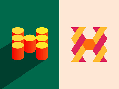
2 of my favorite lettermarks I did for letter H for 36daysoftype in 2020. The right one feels like it's twisting shapes and the left one plays on perspective.
Which one do you guys like the most? Left or right?
2 of my favorite lettermarks I did for letter H for 36daysoftype in 2020. The right one feels like it's twisting shapes and the left one plays on perspective.
Which one do you guys like the most? Left or right?


