Isometric Perspective E Lettermark - 36daysoftype

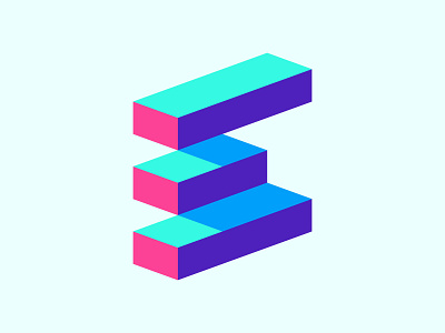
One of the ideas I explored for 36daysoftype challenge this year and it's easily one of my favorite logos. The placement of the shapes and the color choice almost makes it look like an optical illusion.
What do you guys think?


