Lanes Coven Theater Co. Logo

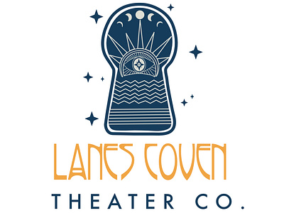
The theater and I went back and forth over the span of about a month on this design, and for the most part, this was the vision we all had throughout the process. While there were a few different iterations of this this is what we kept coming back to. Something that felt nautical, and occult like while at the same time feeling whimsical and approachable.
Since the theater is situated in Massachusetts, in a little fishing village that is fairly close to Salem, the company wanted to tie all of that into the logo: so we have a setting sun, with an eye in the middle: a compass rose acts as the iris of the eye, and if you look closely there's actually a seagull in the middle of the compass rose. The lines represent water and land. All of this fits inside of a keyhole. We wanted it to feel like you were peering into another world, catching a glimpse of something magical.


