Poster concepts for Holiday Playalong Event

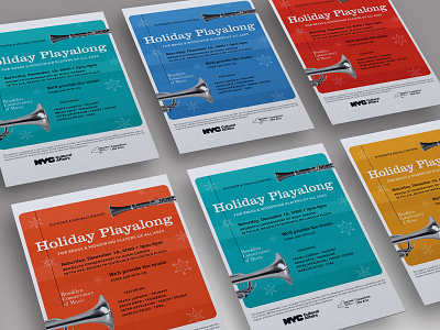


I do all my poster work in InDesign. Its all about the layers palette. It's important to keep all similar elements on the same layer, not to be rule-bound, but to be free. Free to experiment. Free to easily duplicate just a certain class of objects. Free to not waste time when you need to re-purpose this design in 5 different sizes. In the first phase of poster design, I always like to put all the text on the page, clean it up in InDesign, eliminating every single empty space and extra return, put some space between the paragraphs, and let the story that the text is telling inform my future layout. I don't bother really designing until I understand the relative size relationships of the text sections in their linear narrative order. Title, subtitle, body copy, date/time/place, call to action, partner logos, fine print. Once those are all on the page, I can almost close my eyes, and the force guides me. The force being 20 years of experience designing layouts. In this case, I also just dumped the BKCM color palette on the page, but this being a holiday event, I knew I'd have to dial it back. No problem. I start from crazy, then work at sane.


