Heron-Powers | Rebrand 2/3
A fun brand refresh for a local insurance company. They've been serving their community for 30+ years with no real branding or standards.
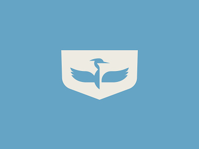
The client wanted a logo that evoked strength and knowledge, and one that would standout amongst their local competitors. Sometimes the obvious is the right answer so I created a heron mark with a powerful wingspan.
This is the badge version of the mark.
View all tags
Posted on
Dec 9, 2020
More by Kyla Henry View profile
Like


