BRANDING | salon logo in denver, co

Ali, stylist and owner of W Style, came to me seeking a truly unique brand identity, infused with personality and rich with symbolism.
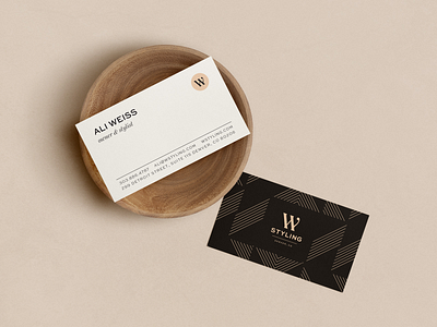
Together, we steered clear of the tropes found in this space (see: overtly feminine imagery, millennial pink, handwritten scripts, etc.) and instead created a bold and luxurious salon brand that isn't afraid to stand out in a crowd. ⚡️
Hardworking, confident women know that they are worthy and deserving of relaxing and high-quality services, period. Within her monogram, the two parallel lines of the W are meant to represent a pause symbol, indicating that her clients understand the inherent value of rest and taking pause—it's what allows them to show up as their best selves. The rounded serif on the far right symbolizes a period because this time to rest and recharge is non-negotiable. Period. 💯
If you're in Denver and you or someone you know values their hair as much as their self care, be sure to check out W Styling at her salon in Cherry Creek. You won't regret it! ✂


