


D1 Flagship Can Designs

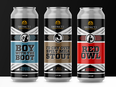
The overall can design was inspired by the brewery itself which was once home to a Red Owl grocery store. The nearly 7,000 sq. foot building has been totally transformed and is now a very modern looking industrial detailed building.
Under the bar is a series of these very eye-catching panels of suspended metal which are represented on the can as the diagonals framing the front of the can.
As a way to differentiate D1 beers on merchandise or on menus, we decided that each of the flagships would have a unique icon. We worked up a few different approaches, and eventually landed on black and white silhouette that represented the beer name which is often referencing local history, culture, or community.
The final cans use a limited color scheme-black and grey connecting to the brewery which will be carried throughout the series, and then a specific color to represent the individual beers. The back of the can has a short description of the beer, a Fact usually related to the icon, and then some pairing recommendations which have some simple illustrations we created to give a visual along with the text.


