Find designers
Designer search
Quickly find your next designer
Post a job
The #1 job board for design talent
Inspiration
Courses
UX Diploma
Learn UX design from scratch in 6 months
UI Certificate
12-week UI skill building for designers
Live interactive workshops
with design professionals
Jobs
Go Pro
Log in
Dribbble: the community for graphic design
Log in
Sign up
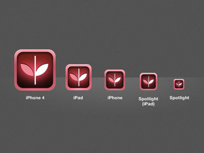
Beyond the Shock icons (Breast Cancer Awareness)
Sarah Parmenter
Follow
Following
Like
#545454
#2C0F0F
#AF4A55
#F0EBEB
#DC97A1
#DC7887
#6B3F44
Download color palette
This image has been downsized from the original to show all icons.
iphone
View all tags
Posted on Apr 11, 2011
3,821
1
30
5
View feedback
Sarah Parmenter
More by Sarah Parmenter
View profile
Previous
Next
Loading…