Rosetta Logo 2/3

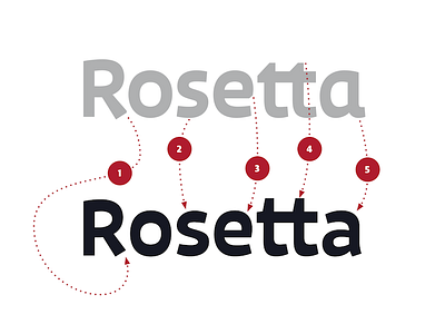
And here is what we did (besides slightly higher contrast and better spacing):
1 – removed one silly facet
2 – more balanced “s”
3 – removed another silly facet
4 – longer extenders (hated them)
5 – make more mature (de-infant-ize) the “a”
but that was not enough.


