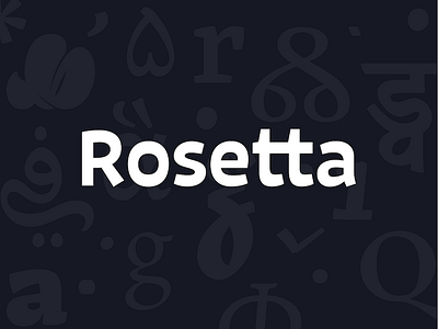
Rosetta Logo 1/3
It took quite some time to redesign (ok polish) our logo and get it into a more mature state. The original concept was to bring a bit of the reversed contrast styling present in Indic letterforms to the Latin lettering. Connect European forms with non-Latin styling. Good fit for a multi-script type foundry I would say. Here are some details and comparison with the old one.
View all tags
Posted on
Mar 13, 2014
More by Rosetta Type Foundry View profile
Like


