Responsive High GroundLogo Design

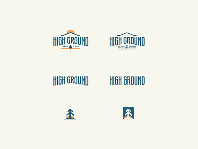
The High Ground logo is part of a logo system that has day time and night time modes, and a variety of options ranging from full detail to just text and symbol.
The base font for the logo was DIN Condensed. To give the letters a taller "higher" look, I raised the crossbars in the H, G, R, and N. The idea here is to make the letters look taller, or "higher".


