Taryn Grey Photography

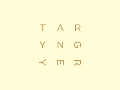
The two orientations utilised within the logotype, splitting first and last name, work in conjunction with a mixed landscape and portrait approach to print and layout, a detail reflective of the formats of photography.
The 3x3 layout was informed by the rule of thirds, a photographic principle that typically underpins good composition.
A variety of pastel coloured papers softens what is a fairly stark sans-serif functionality with a femininity while a surface emboss gives the collaterals a craft sensibility.


