New Era - logo design


New Era Logo Design
ABOUT THE CLIENT
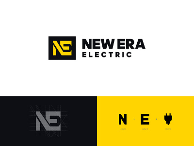
New-Era Electric is a locally owned family business offering residential, commercial and industrial services and preventative maintenance.
CHALLENGE
The goal of this project was to create a unique and distinctive logo for a business in a crowded industry. Colin, the founder of New Era Electric, wanted a logo that represented the idea of electricity without using any cliche plug or lightning symbols to avoid looking generic.
SOLUTION
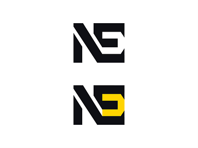
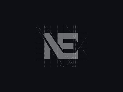
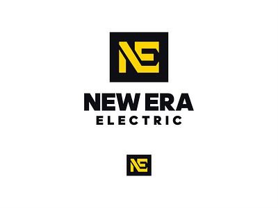
For this project, I focused on creating a distinctive monogram. Since the company name is long, it would be hard for the logo to be versatile with a wordmark-only execution. The last two words in the company name start with E, which allowed me to create a monogram with the letters NE rather than repeating the letter E twice. To achieve the goal of representing the idea of electricity while not looking cliche or generic, I used the negative space within the letter E of the monogram to create an abstracted plug shape 🔌.
Check out the full project on my website:
www.kaejon.com (link in bio).
_______________
Do you have a project you’d like to collaborate on? Email me: hello@kaejon.com


