Aunt Jemima Rebranding

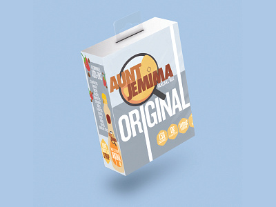


After hearing about Aunt Jemima needing to rebrand their logo, due to controversies, I decided to give it a try. I wanted to keep the fun spirit of making pancakes, or waffles, in the morning for children but still draw attention to the parents who would be making those pancakes. Who said parents didn't want chocolate chip pancakes in the morning too? The logo represents a skillet with the batter being fried, yet the name is still the main source of information, the icon of Aunt Jemima has been taken out of the packaging completely though. The add-ons and waffle concept shows different variations this content can bring to a target audience and makes it fun to envision on your plate to eat.


