


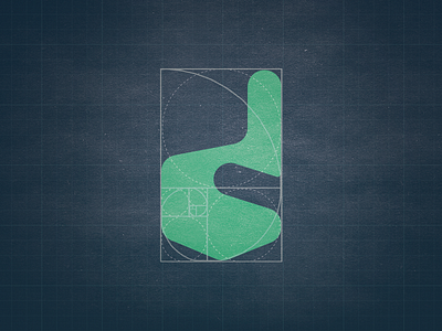
Finger icon and "d" letter according to golden ratio

Hey!
Heres our work together with @ALL4LEO : 2 in 1 logo showing a pointing finger and "d" letter. Client required that icon should be constructed strictly following golden ratio proportions.
We loved this idea, but sadly, this is a rejected proposal.
Check out our portfolio: Branding Design Agency
Check out ALL4LEO portfolio: Unique Logos


