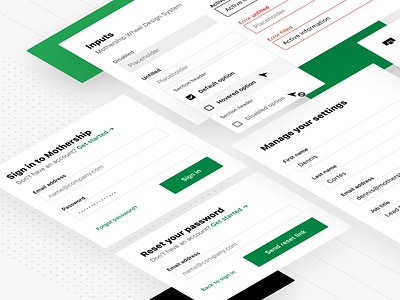
Inputs - Wheel Design System


In case you missed it, we launched our new design system Wheel 🚚
For this post I'll be showcasing our inputs. We wanted our inputs to be simple yet powerful, while each state and variant having a recognizable difference to teach users passively as they use our new design language.
We have 5 states—Disabled, Unfilled, Active (or Focused), Filled, and of course Errors. For variants we have Default, End Icon, Front Icon, Action, Box, and Upload variants each with optional hints when needed in context.
We created a 3-tiered color system (both for dark and light UI) that informs states and variants options, and makes it really easy to decide styling and interactions.
Inputs are meant to grow to their containers, and our dropdown options reflect this as well while adding options for multi-select, icons, and section headers as needed. With the way we created these components using Auto Layout, we are able to easily hide/show these as needed while still using only one component.
All our inputs were built completely on an 8pt grid to reduce any discrepancies across both the design and development teams. We even worked closely with Engineering to create 1:1 versions of our components in React, and I was able to work on and contribute to the codebase for it.
Also, we're HIRING remote designers! Want to work on cool stuff like this, have ownership in your work, drive the product vision, and change the future of one of the world's largest industries? Come work with us 😎 apply at → https://www.mothership.com/careers


