Responsive Web Design: Personal Site

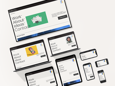
Mockups of my new personal website (launching soon) shown in responsive layouts, including: Apple XDR, MacBook Pro 15, MacBook Pro 13, iPad 11.5, iPhone XR, and iPhone SE.
Nowadays, web designers must program website layouts that respond to thousands of different screen sizes. It wasn’t always this much work, back when there was only desktop computers.
When we make design choices for a website, we have to think about how it will look on desktop, how it will shrink down to a tablet, and how it will stack vertically on mobile screens.
If our dream client, or a future customer is visiting our website, we can not control which device they are using, but we can control how our content looks on that device.


